 |
 |
| Before noise removal | After noise removal |
Abstract
An analysis of a scanned copy of the 1599 Japanese edition of the Guia Do Pecador has been carried out in an attempt to ascertain whether certain sequences of characters were printed using single pieces of type. The results of the study strongly indicate that for all the sequences examined, there is no clear evidence that single pieces of type were used, and in many cases it is clear that the characters and ligatures were printed with separate type components.
Introduction
This paper reports on an analysis of the キリシタン版 text Guia Do Pecador (Guia de Pecadores in the original Spanish) written in 1567 by Luis de Granada (1504-1588), a Spanish Dominican priest. The Japanese translation was published in 1599, possibly in Nagasaki.[1]
The analysis uses software developed by the author in 2001 during a period spent at the Research Institute for the Languages and Cultures of Asia and Africa (ILCAA) at the Tokyo University of Foreign Studies.[2] This software was developed to enable manipulation, extraction and measurement of scanned Chinese and Japanese texts.
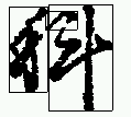
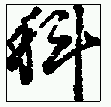
One feature of the キリシタン版 editions is the extensive use of ligatures with kana (しき, する, いふ, etc.). In the analysis described in this report, a number of pairs of adjacent characters or ligatures have been examined to ascertain whether they have been printed using single pieces of type (hidden ligatures.) The candidates for this examination have been identified by Prof. Toyoshima Masayuki at the RILCAA.
Printed Character Identification and Analysis
The analysis described in this report has been carried on a scan of a photocopy of the copy of the Guia Do Pecador in the Vatican library. The scan of each double page has resulted in an image of 4,945 by 3,504 pixels (approximately 300 DPI), which for the 美濃版 (minoban) paper size (approximately 28.2cm x 20.0cm per page) results in a resolution of 107 pixel/cm (0.093mm/pixel).
The analysis has only used the first volume of the text, comprising 212 single pages, not including the index or table of contents. The second volume, with a further 160 pages of text, is available if additional analysis is to be conducted.
In order to analyze the printed text, it is necessary both to identify each character, or group of characters when they have been connected using ligatures, and to establish the dimensions of each character or ligature group and its placement on the page. Traditional optical character recognition (OCR) techniques usually involve the development of a library of character shapes and components which can be used via a variety of pattern-matching techniques to identify the characters in the text. The use of such a system was not considered suitable as it would have required development of an extensive library to cover the cursive script and ligatures used in the text, and would not have delivered the measurements of the character locations.
Accordingly it was decided to reverse the traditional OCR process and to attempt to identify the location and dimension of each character as an abstract printed object before carrying out any identification.
The process used for each page of text was:
|
|
| Before noise removal | After noise removal |
 |
 |
The process described above correctly identified about 95% of the characters and ligature groups in the text. The main problems occurred at the page edges where artifacts interfered with the combination of elements. Also a number of pairs of small characters, such as 一ツ, were wrongly combined.
As the identification of characters described above was not associated with the actual placement of the characters on the page, the next task was to identify the column by column sequence of characters. This was done by identifying the upper right-hand corner of each page, identifying the uppermost character in the first column, then navigating down each column in turn, compiling a catalogue of the character images encountered.
At this stage a database of approximately 120,000 character images had been compiled, along with their dimensions and page locations. As we wished to be able to identify characters or sequences of characters, training software was developed which could learn the the characteristics of characters or ligature groups, then use those characteristics to identify occurrences of the characters or groups in the text. The highly varied sizes of the characters and groups meant that it was possible to carry out accurate identification using two basic characteristics:
Possible Hidden Ligatures
The initial application of the analysis system described above has been to attempt to determine whether certain common character sequences had been printed as "hidden ligatures", i.e. although the component characters are not joined, the sequence was nonetheless cast as a single piece of type. The character sequences identified for this analysis are shown in Table 1 and examples of their appearance in the printed text are in Figure 3.
| Sequence | Occurrences |
| いふ共 (いうとも) | 26 |
| いへ共 (いえども) | 61 |
| 顕し (あらわし) | 31 |
| 奉りて (たてまつりて) | 23 |
| 嗚呼 (ああ) | 32 |
| 頼母敷 (たのもしき) | 54 |
 |
 |
 |
| いふ共 | いへ共 | 顕し |
 |
 |
 |
| 奉りて | 嗚呼 | 頼母敷 |
If the printed form of the candidate pairs of characters or ligatures shown above are the result of being printed from a single piece of type, a fixed spatial relationship between them should be discernible. In other words the components should not display any marked variation in horizontal or vertical alignment with respect of each other.
Analysis of Ligature Candidates
The training system described above was used to identify and extract information about the pairs of images associated with each occurrence in the printed text, resulting in a database of information for each ligature candidate. In the case of 頼母敷/たのもしき the extraction and analysis was made on the two kanji pairs: 頼母 and 母敷.
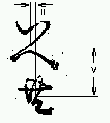
Two measurements were made of the images comprising the ligature candidates:
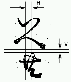
A potential weakness in this measurement is that it is based on the edges of the printed characters, and hence is susceptible to errors caused by ink spreading, paper shrinkage or stretching, smudging, etc.
If the pairs of characters or groups have been printed using a single piece of type, it would be expected that the measurements described above would vary very little between different occurrences of the candidate. In fact the measurement could be expected to vary by a small amount if they were set separately, as a human typesetter would tend to position them in a similar fashion each time they are set. The measurements taken in this analysis show a considerable degree of variation. Figures 6 and 7 are plots of the two sets of measurements for the いへ共 ligature candidate.
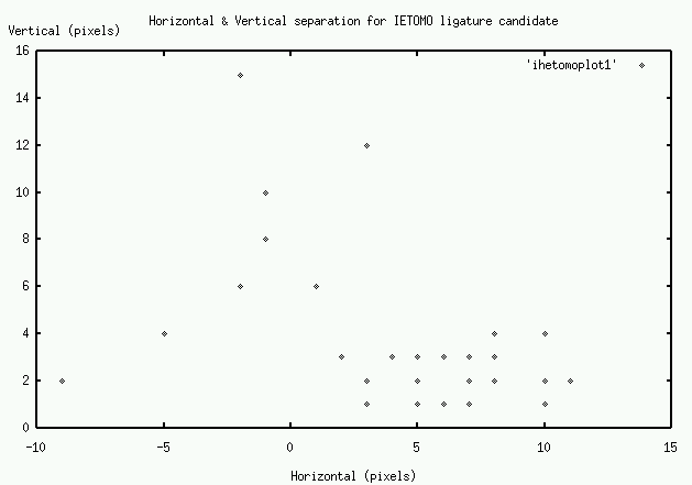
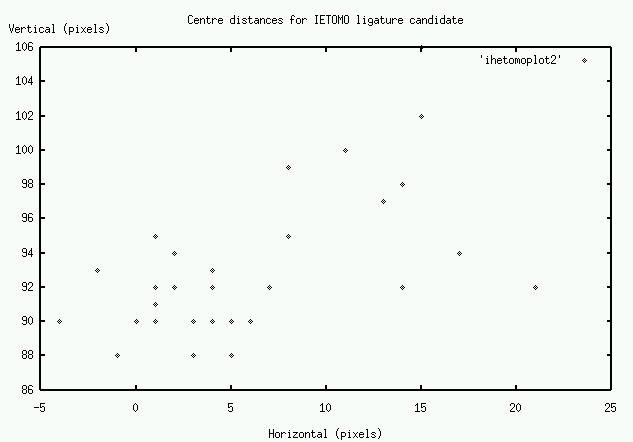
As can be seen from the plots, while there are a large number of cases clustered in a 0-10 pixel range (approx. 0-1mm), a significant number display considerable variation in spacing. Figure 8 shows three of the candidates which show a large amount of variation. The first shows a case where there is a larger vertical separation than usual, and the second two show the two extremes in horizontal separation.
 |
 |
 |
Another method of analyzing the variation in spacing is the consider the Standard Deviation of the measure. This is a common measure of dispersion, and a large Standard Deviation indicates considerable variation. Table 2 shows the Standard Deviation of the four measures taken of ligature candidates.
| Candidate | Separation (H) | Separation (V) | Centre (H) | Centre (V) |
| いふ共 | 3.98 | 5.64 | 4.78 | 6.11 |
| いへ共 | 4.55 | 3.33 | 6.12 | 4.16 |
| 顕し | 3.60 | 2.09 | 3.66 | 2.28 |
| 奉りて | 3.69 | 3.34 | 5.35 | 3.73 |
| 嗚呼 | 12.59 | 8.87 | 8.80 | 8.77 |
| 頼母 | 2.05 | 1.51 | 3.04 | 1.41 |
| 母敷 | 1.97 | 1.96 | 3.38 | 3.13 |
These measurements indicate different levels of variation between the candidates. In general there is more variation in the horizontal measures, which could be explained by typesetters using slightly different placements whereas in the vertical alignment the pieces of type would usually abut each other.
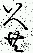
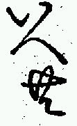
Even in cases where the overall variation is not large, such as 頼母敷, there are individual examples where the variation is enough to be visible. Figure 9 shows two occurrences of 頼母敷 (on page 81ウ) where the relative displacement of 母 (8 pixels) is large enough to be visible.
 |
 |
In an attempt to make a statistical comparison with a recognized ligature, an examination was made of the する ligature, which occurs several hundred times.

The ligature, which is an average of 164 pixels in height, was divided in two parts horizontally, and the centres of the two halves compared. This revealed horizontal and vertical standard deviations of 2.00 and 1.88 respectively. These are generally smaller than the equivalent standard deviations in the table above, and in some cases the difference is quite marked. If we take the results for する as typical of a ligature, the results for the candidates would probably lead to the rejection of the hypothesis that they too had been printed as ligatures.
Conclusion
The analysis described above clearly does not provide any evidence that the ligature candidates were printed using single pieces of type. In fact the measurements taken indicate that variations in the spatial relationships of the components of the ligature candidates are greater than can be explained by factors such as ink spread, paper stretch or shrinkage, etc. The inevitable conclusion is that the variations are more likely to be due to fluctuations of type placement by human typesetters.
References
1. D. Chibbett: The History of Japanese Printing and Book Illustration, Kodansha International, 1977.
2. J. W. Breen: Software Tools for Text Analysis, Institute for the Study of the Languages and Culture of Asia and Africa, Tokyo University of Foreign Studies, Report, June 2001